Charts and dashboards
Show the results of a planning model as charts, tables, KPI cards, and text on the Charts page of the model.
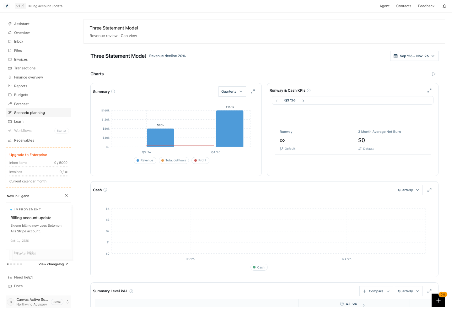
Each planning model has a Charts page. The page is the dashboard of the model. It holds cards: charts, tables, KPIs, and text. Each card reads live values from the model. When a value changes in the grid, the cards show the new value.
Use the Charts page when the shape of a result is more important than one cell. Examples are a cash trend for a board review, revenue by quarter, or plan against actuals. Use the grid when you need to read or change formulas and inputs.
To open the page, go to Scenario planning → open a model → select Charts. To go back to the grid, select the chart icon next to the model name. Its label is Open spreadsheet.
A new model starts with seven cards: Summary, Runway & Cash KPIs, Cash, Summary Level P&L, Detailed P&L, Revenues, and Expenses. The page header shows the model name, the scenario, and the date range. An editor also sees Share dashboard. A teammate who receives a Can view saved view opens this page and cannot change it.
Pages in this group
- Create a chart: add a bar, line, or combo chart and choose its variables.
- Tables: add a table, edit inputs in a dimension table, and read the P&L tables.
- Compare scenarios and versions: switch the scenario of the page and compare a saved version with actuals.
- Time aggregation in charts: show months, quarters, or years, and limit the date range.
- Export and share: export the model to a file, save a chart image, and share a saved view.